
Developing my design and printing skills
- Dec 13, 2018
- 2 min read


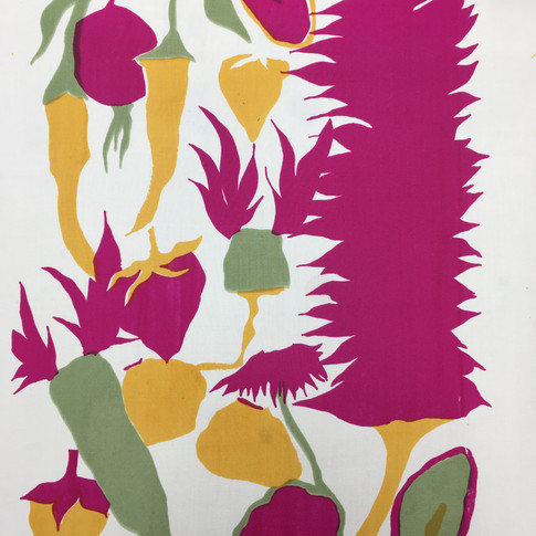

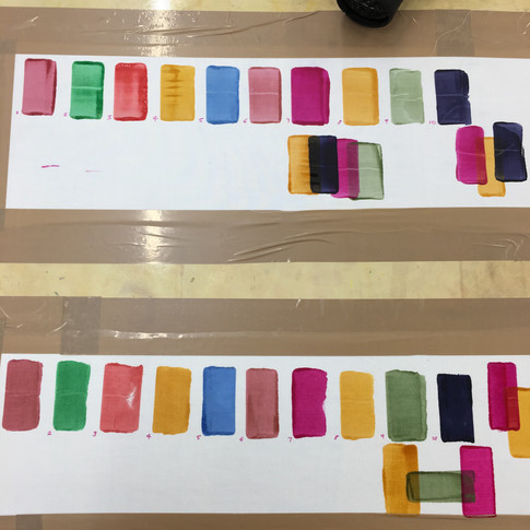
For my first design I have experimented with discharge, illuminating discharge, Devore, opaque binder and procion/acid dyes. Procion printing was the easiest one to do out of my samples as it was a quick and easy process, the only difficult part was lining the design up accurately. I liked my colour schemes for these samples as they linked to my original colour scheme and have a contrasting effect. The top left sample was printed onto a Bamboo Silk Satin, I used 4 acid dyes to print my design and the other design was printed onto a Bamboo Melody, my colour samples were tested on both Bamboo Melody and Mercerised Cotton as I was debating between these two for printing my procion dyes, this gave me a way to see what the colours look like on different fabrics and how they change slightly.
Moreover, when showing my tutor my designs she said I was on track with my work as I was experimenting a lot within my samples, however my designs had quite a lot of negative space which makes it look quite boring and not so appealing, especially to my target audience, children want to see designs filled with colour, shapes and patterns. I thought it was time for a new design, so I drew out my design onto some A3 paper, then traced over this with 4 pieces of drafting film, three of them being parts of the design, and the last being everything (the detailed layer)
Adding more detail and definition into my drawing enabled me to develop my design and I also added small shapes into the background and in-between the drawings to get rid of the 'negative space'.


Comments